
Badges
Product Designer • Mar 2020 - Feb 2021
Pluralsight users often struggle to stay engaged in their learning on our platform. By introducing badges as a way to celebrate our learners’ success and encourage them to keep learning, Pluralsight is seeing a positive shift in engagement metrics of weekly retention rate and feature adoption.
Overview
Problem
Our learners struggle to stay motivated in reaching their learning goals and understanding what Pluralsight has to offer to help them develop their skills. The product has had a hard time keeping learners engaged with the platform, which has led to churn or lost expansion opportunities.
Solution
The team created a new badge system that celebrates users’ continued learning and encourages learners to explore the product more and create learning habits. I collaborated with product managers and designers across the org in strategically selecting next badges. The badges are available throughout the platform and have various touch points to keep the learner engaged.
Outcome
After a month in general release, we had early indicators of success. 5th week retention was up over 2%, visits per visitor to the platform increased 4%, and features with badges associated had increased utilization of a total of 1.6%.
My role
Prior to the creation of badges I researched, presented, and advocated for the creation of a team focused on gamification. Because of these efforts, a team was formed where I was the sole designer, co-leading the team in strategy, direction, & research with my product manager. I designed the user flows, created the visual & interactive designs, designed prototypes, and conducted visual quality assurance.
What is Pluralsight?
Pluralsight is a technology skills company, providing quality content for learners to up skill in the tech topic of their choice. Pluralsight’s mission is to democratize technology skills. Though initially focused around video content, over the last few years Pluralsight has expanded its resources to include hands on content, collaborative learning, and more.

A brief history
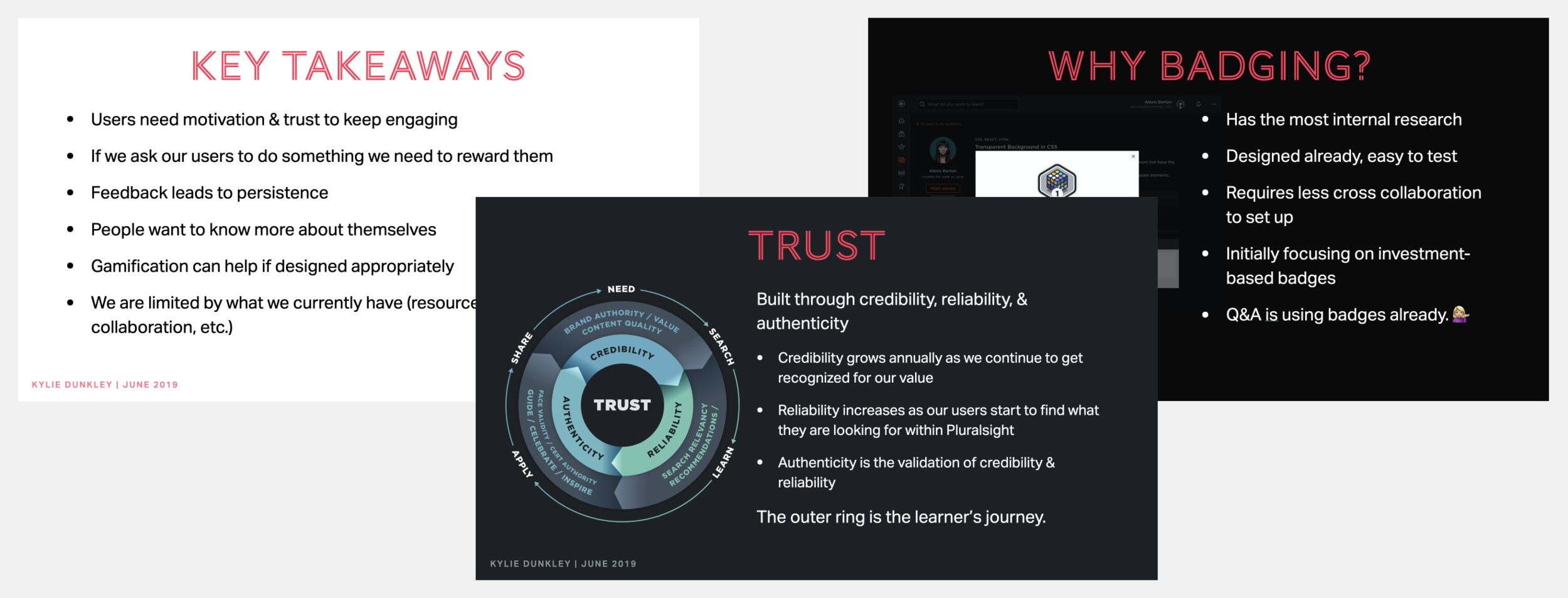
While I was working on increasing engagement of the Q&A Feature, I started exploring gamification techniques, and more specifically ways to encourage exploration of the feature. I interviewed coworkers who had previously explored badges, and researched best practices/gamification techniques to curate a more holistic view of badges within Pluralsight. Based on this research, I concluded that for badges or any gamified experience to be successful, it should be present across the experience and not just focused on one feature. Upon this discovery I presented a slidedeck to various levels of leadership as to why Pluralsight should invest in a team focused on engagement through gamification practices. Shortly thereafter a team was formed and I joined as the sole product designer.
Problem Statement
Our learners struggle to stay motivated in reaching their learning goals and understanding what Pluralsight has to offer to help them develop their skills. The product has had a hard time keeping learners engaged with the platform, which has led to churn or lost expansion opportunities.
Preliminary Research
Starting with the research I had already conducted (namely reading Actionable Gamification by Yu-kai Chou, looking at industry examples and best practices, as well as interviewing coworkers who had explored different parts of gamification previously), our newly formed team started with a kick off workshop to narrow in our focus. This workshop included members from teams across the organization that focused on our primary user, the learner. By gathering teams across the org we were able to determine what a Pluralsight’s user really cared about and what their “jobs to be done” consisted of, primarily to learn a new skill/topic. With this understanding, the product manager and I weighed the pros and cons and decided that to best help our user we should create a badging system. A badging system gives a user a digital visual badge for achieving a certain task, badges motivate users to complete certain tasks, like keep learning, and celebrate their successes.
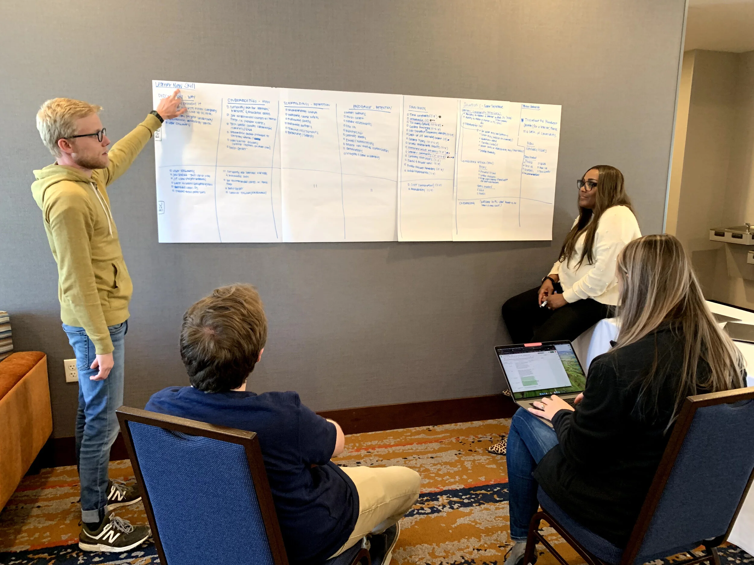
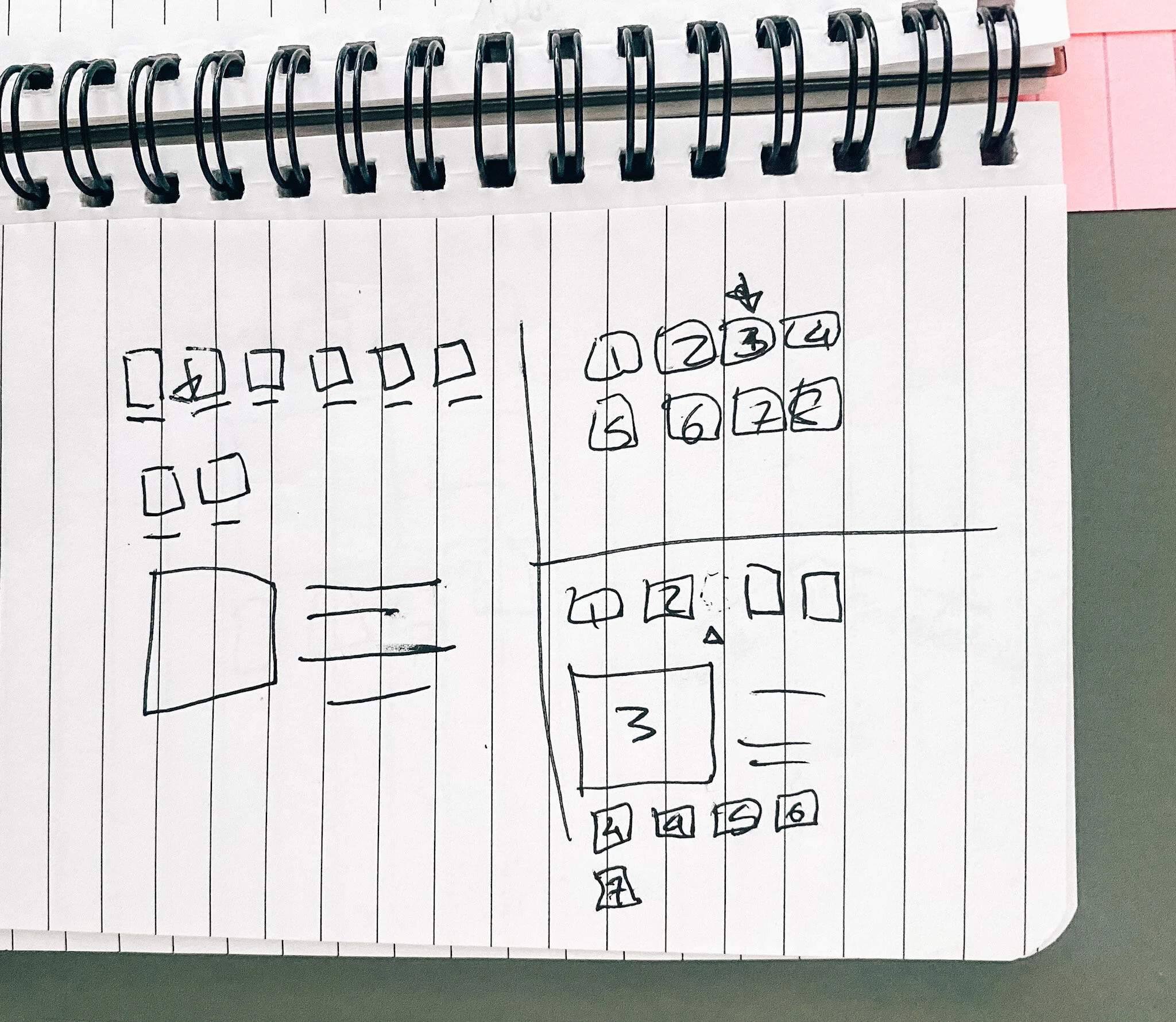
My breakout group exploring the journey and “jobs to be done” of our users.
Ideation (our first badges)
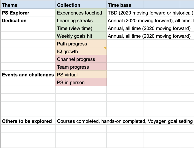
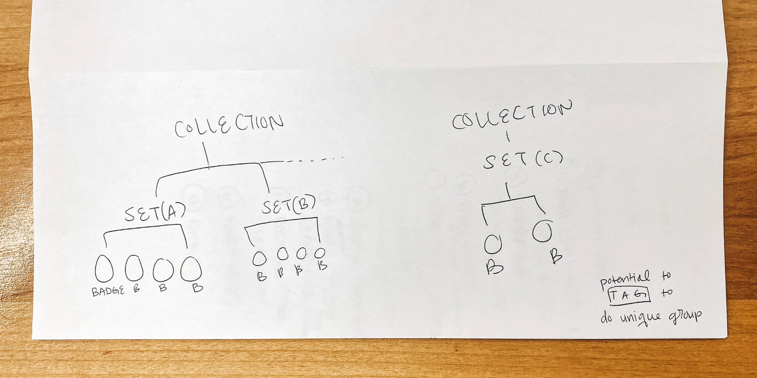
With a better understanding of our users and their “jobs to be done”, we explored what we should encourage users to do first. Our first badges needed to be beneficial to our user and have the data easily available. We decided to start with two types of badges: all time and annual.
All time badges are a one and done feature, meaning you can only earn them once, whereas annual badges reset each year allowing users to earn new badges for the same metrics but within the new timeframe. The first set of all time badges, which we call explorer badges, encourage our user to try out various features of the platform (the user earns the badge by doing a certain combination of tasks).
Annual badges are badges that can be earned each year. For these badges we decided upon three sets to start with: view time, streaks, and weekly goals. View time data was readily accessible since our team already pulls that data for another feature we own, the Goals Widget. Plus, according to our qualitative data, users expected view time to be one of the first badged aspects of Pluralsight. For Streak badges, we partnered with the profile team, who already gather and showcase to users their streaks, to figure out the metrics that would best motivate learners without creating unhealthy learning behaviors. Together we concluded that instead of rewarding a running streak, we would badge milestone streaks and hitting those milestones a certain amount of times. This way, our users are still encouraged to learn without fear of missing a day and destroying their chance of getting a specific badge. Weekly goal badges mark how many times a user hits their weekly goal in our Goals Widget.
Having 4 sets of badges determined, I started sketching ideas on how/where to display badges, how our user is notified they have earned badges, and visual elements.
Designing an experience
When starting to design the experience, there were two major considerations: where the badges would be housed on the platform and how a user knows they earned a new badge. Once those concerns were solved, the next question was, “What do the badges look like?” These three questions created constraints and narrowed in my focus on the most important work to be done.
Where should badges be housed on the platform?
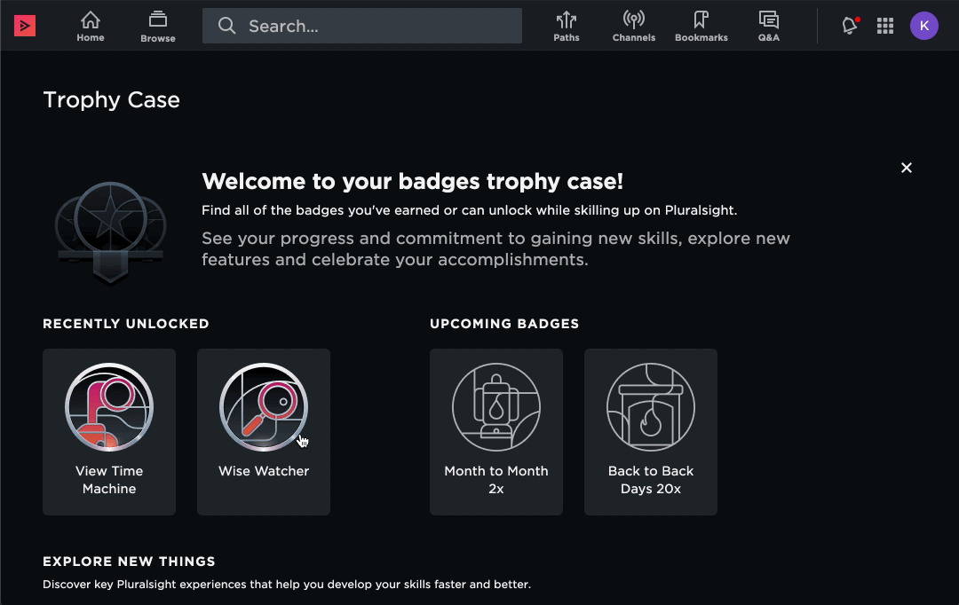
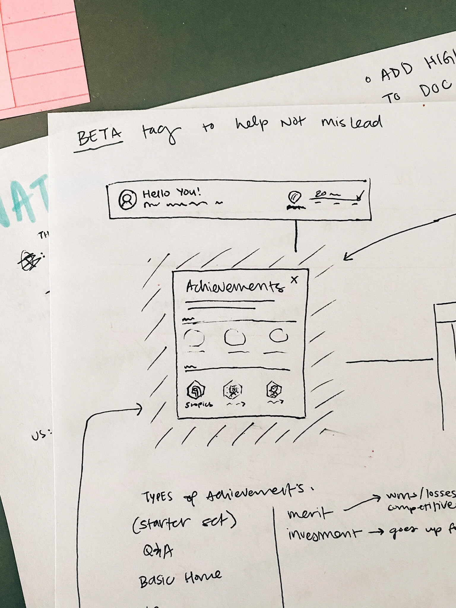
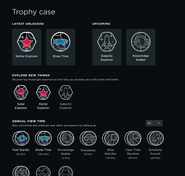
After all the research, it was apparent to me that to be successful, badges live throughout the site, but needed a place to sleep at night, a home where people would know to find all of their badges. Through best practice research and qualitative data it was easy to conclude that badges should sleep on our user’s profile. Unfortunately, the profile team had other priorities (which consumed their development resources), and our teams decided for our MVP we would have a page that was owned and developed by my team, and the profile would link to it. This way the profile team could showcase some badges without all the heavy lifting of housing them. I partnered with the profile designer to create this showcase view, sharing our assets and strategy for how we display recently earned and upcoming badges.
How does a user know they earned a new badge?
Behavior change studies show that consistently celebrating someone when they do something good immediately creates a memory that if they repeat the action they will again get a reward. I hoped to tap into this by displaying the badge to a user the moment they earned the badge through a modal. Unfortunately, the platform (as of the time badges were being built) was not yet capable of being able to read that data and display a modal anywhere on the site, so I explored alternative solutions.
Our other solutions are utilizing in-app notifications, emails, and another widget on the home screen. Notifications was an easy win since it already existed, but it lacks the traffic we desired to make sure badge earners saw the alert. Emails are helpful but can easily overwhelm our user or can be turned off, so I designed an aggregate email that users will get once a week if they earn a badge that week. Our option for having a widget on the home screen had the most promise for many reasons. I explored different ways to show badges on our user’s home page and, thanks to our already close relationship with the home team, we were able to negotiate space for our widget.
I also partnered with the video player team’s designer on an experience within their system that would display the badge shortly after the learner received it. We explored instant notifications within the video player, but for our MVP experience we decided to work within their existing framework and delay the notification to between modules. The video player team uses a modal like experience between modules to seek feedback from the user. Together, we decided that this would be the best place to add badge notifications due to the minimal lift for our development teams. This collaboration resulted in users always being able to see badges they are close to earning between video modules and an additional state for when they earn a new badge from watching the last module.
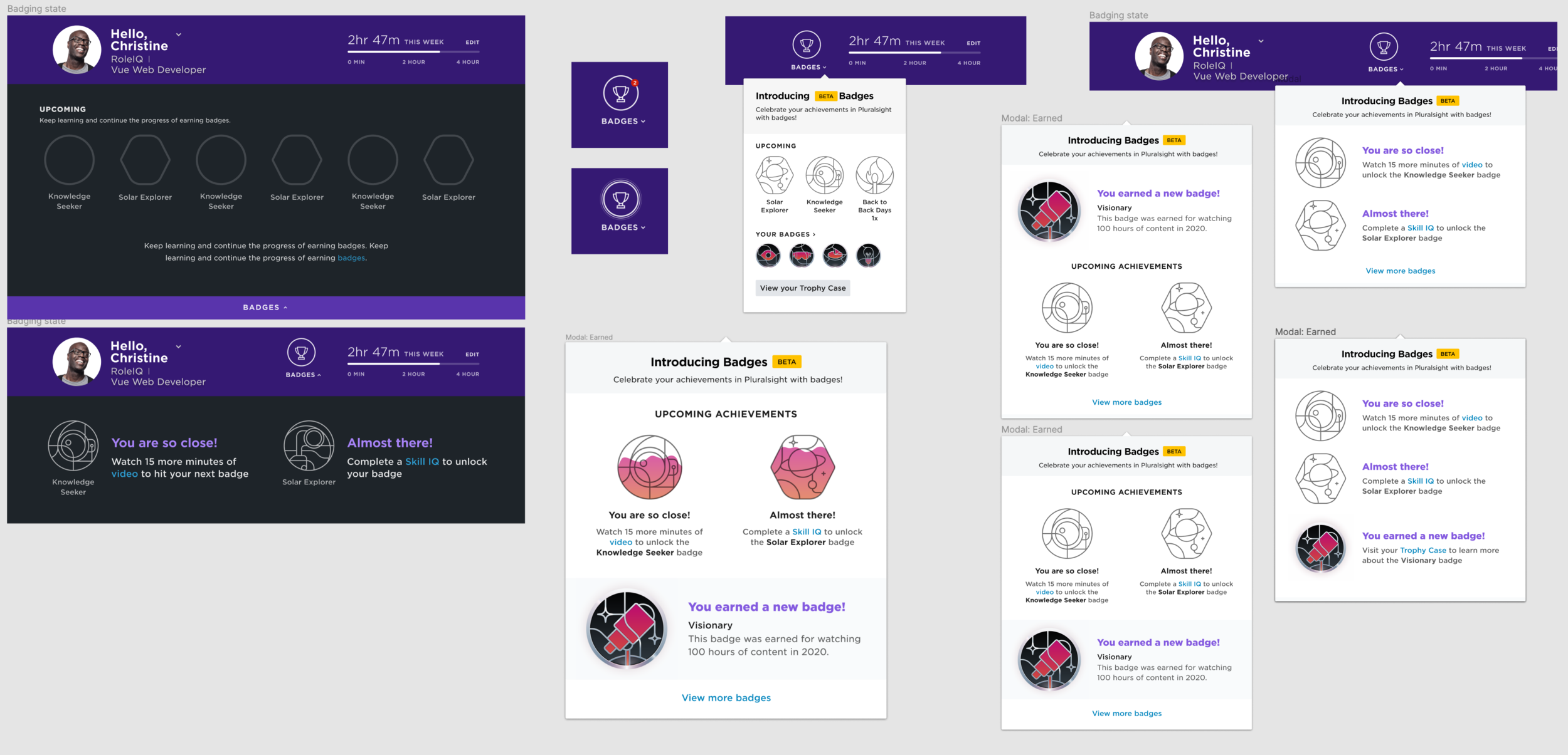

v1 modal explorations
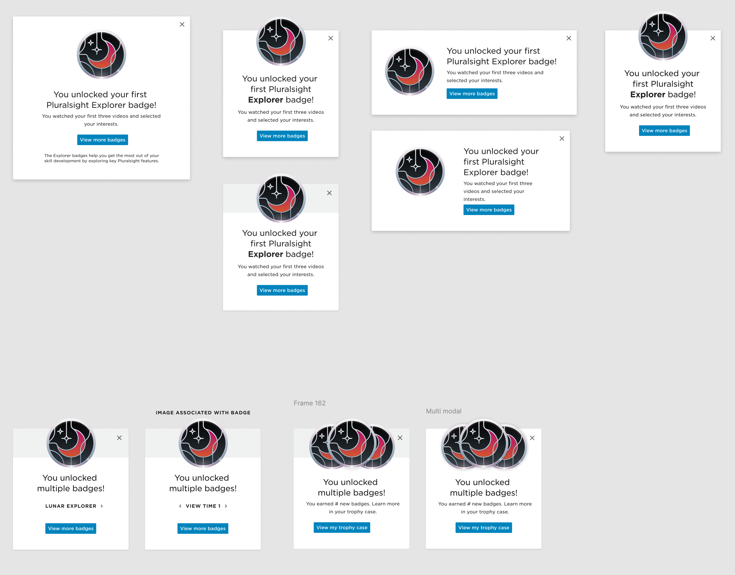
v2 modal explorations


The first visual representation is one of the explorations the second was the agreed upon style.
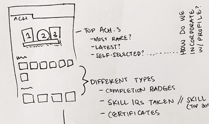
What do the badges look like?
Prior to badges, the Pluralsight application had almost no illustrations in the design system, and what was there was very minimal and icon based. When I started to design the initial experience using placeholder badge visuals, Pluralsight decided to clarify our brand identity in illustrations. A small group was formed, consisting of the head of brand, a brand designer, the head of product design, and me, to narrow in Pluralsight’s illustrative style starting with badges. We each brought ideas to the table and together focused on a central style. Our head of product design, Justin Mezzel, illustrated our final selection and the style I used as a template for the badges we have today. Now that we had a style, I needed to design the badges for production.
For each badge set, I focused on a central theme. Explorer badges, with names like Solar Explorer and Stellar Explorer, revolved around space. View time badges, based on time spent watching content, focused on different ways one views things, like with glasses or a telescope. Weekly goal badges, which are determined by hitting your time-based goals, centered on telling time. For our streaks, I collaborated with the profile team’s product designer on a theme of fire and light, since fire is strongly associated with streaks in and out of our platform.
With each new collaboration, I strived to work with that team’s designer to select a theme that best suited what we were badging. Once a theme was selected, the other designer and I would explore visual representations and choose the best icon-based visual to represent the badge. After deciding upon the visual representation, I would build out the design into a full fledged badge that is cohesive with the other badges in our system.


A page of the badge design system I created to help other designers learn how to build badges that look a part of the whole system.

Screenshots of our usability testing with users throughout the process of building badges.
Testing the experience
Testing is integral to how Pluralsight product teams build features, thus I would be amiss if I left out some of our key findings that led to the polished product we have today.
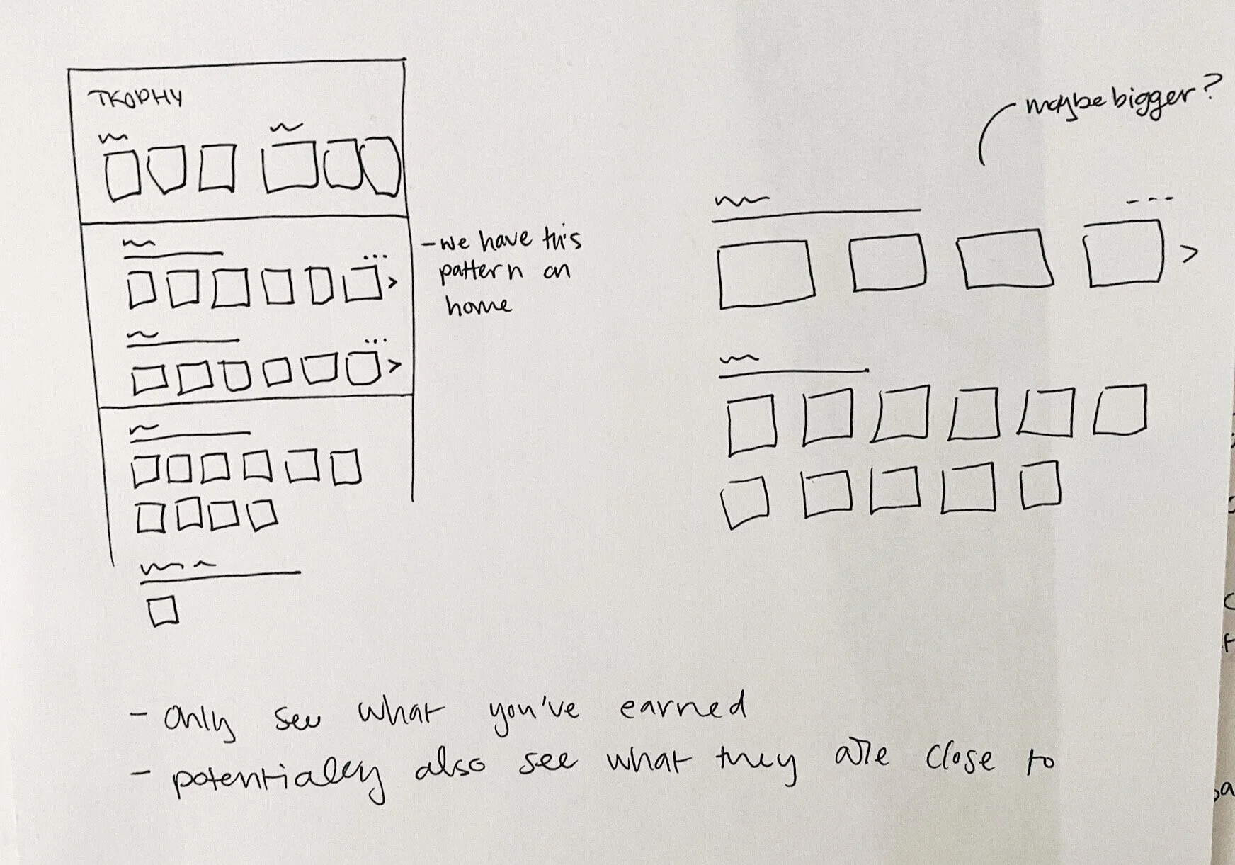
In our first prototype testing, we were exploring how users are notified that they earned a new badge and how they would learn more about the badge. As previously stated, we knew a modal wouldn’t be doable with our current restrictions but wanted to explore if an in-app notification should open a modal or jump straight into the gallery of badges a user could earn. Qualitative testing proved the modal ineffective with 90% of users sharing that they felt it was adding an unnecessary step, where the gallery (which we call the Trophy Case) housed all the critical information they desired. In this same testing, we explored badge levels and what users expect to be badged.
Another significant round of qualitative testing involved new explorations of gamification features involving badges. We explored a company guided experience, social comparisons in the trophy case, and a year in review lookback. Testing these exploratory features led to a common theme: the social aspect of badges. It was very clear that users wanted more information about badges earned in relation to other people but it varied greatly in who those people were. Because our users vary from individual accounts to massive enterprise accounts, we heard numerous different and contradictory answers to whom your badges should be compared to. The result of this variety led us to postpone working on social comparisons in favor of adding more badges so that we can continue testing and narrowing in our target audience.
General release & metrics
To finally get to a full general release of badges to all Pluralsight users, we followed a slow release process which allowed us to test pieces of the product and have success before adding more users to the release cycle. Prior to going to general release analytics indicated a rise in retention and an increase in content view time per visit for those who have viewed badges.
Since the release of the badges feature, quantitative data only continued to support the positive influence badges have on our users. After a month in general release, we saw that 5th week retention grew 2%, visits per visitor increased 4%, and data that indicated a strong rate of return to the Trophy Case. In addition to those metrics, data displayed higher utilization of features with badges associated at a total of 1.6%. These numbers are pleasing to the team and org as we continue to invest in badges.

Post release iterations
Since our general release, I have continued to design additional key features for badges, starting with how to display annual badges and explorations around limited edition or special event badges.

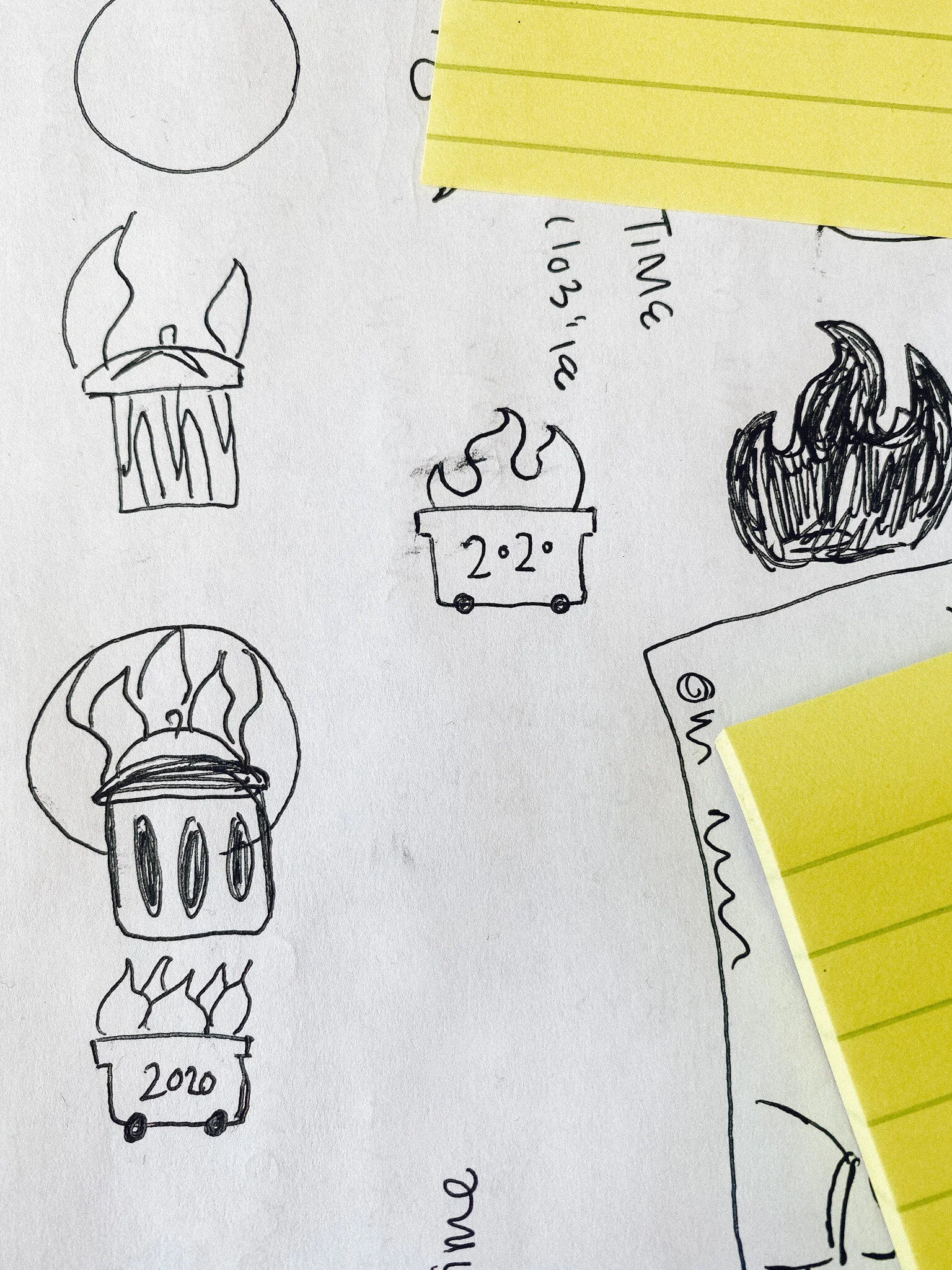
Sketches of how to solve for annual badges.
How best to display annual badges
Because annual badges repeat each year, I explored ways to display the new year badges without adding another line to the lengthy Trophy Case. The strategy for annual badges is that the badge milestones and basic design would stay the same but with a slight visual difference to indicate a new year.
As I started to solve for how to display a new year of badges, I had some concerns about how valuable the milestones would be for a user who already achieved them in the previous year. As I took these concerns to my team, we decided to test it with learners. Through testing it was clear that users still cared about reaching the same milestones and my concern was laid to rest. We will continue to watch our analytics in case there is an indication of a false positive by decreased visits per visitor and users not achieving badges at the same rate as the previous year.
Through this testing cycle, I was able to test a refined idea for the new user experience and the new visuals for the 2021 badges. I was happy to find that, though users didn’t expect the new experience, they preferred it over their expectations. Many expected 2021 badges to be a new line on the Trophy Case but after viewing a single line stacked experience, users shared how much they preferred the update. In this testing, we also learned that users were unsure of a new color scheme and as we tested changing 2020 badges to a unique color in addition to the new 2021 color users were satisfied. Our team moved forward with these designs in preparation for 2021.
Limited edition/special event badges
A major push from our marketing organization was to collaborate on special event badges for their campaigns. This aligned perfectly with our desire to have limited edition badges corresponding with key dates or fun moments to celebrate. Unlike our other sets of badges, these unique badges have a lot more flexibility in shape and color. For these badges, I collaborated with designers in marketing to compromise and come to an agreed upon style that still fits with our other badges. I worked with the head of brand and another brand designer to explore how these could work. These badges will be housed on their own line for Limited Event badges and are only viewable during the designated time frame. Once the event is over the badge has two potential states: if unearned the badge disappears but if earned the badge stays on the line in the completed state. These are just a few of the explorations that I have dived into.
There is so much opportunity with badges and as we receive more data that indicates the usage of badges, the experience will continue to support our users in their learning journey.